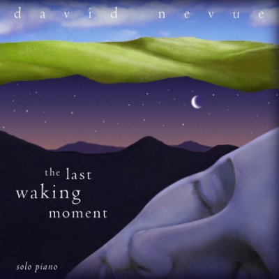
The NEW Last Waking Moment CD Cover...
One of the tasks I've taken on over the last year is to begin reworking some of my older CD covers. With the first three albums, especially, I was never totally happy with the art design. These days, however, I have a terrific art designer who makes my albums look amazing.
Anyway, we redid the art design for "While the Trees Sleep" last summer, and we are finishing up the redesign for my third album, "The Last Waking Moment" right now.
If you go to the link above for The Last Waking Moment, you'll see the old cover. It's not too bad, but it's really dated. The computer rendered imagery looks, well, pretty yucky by today's standards.
I wanted a new cover that had the same "look" in terms of the colors, but that meets with the design standards that I've grown used to from my current designer.
Without further adieu...
Here's the new cover:

I absolutely love it. I think it coveys so much better the album concept as well. The music, you see, tells the story of a lucid dream that my wife had. It took place in a beautiful emerald valley, which will be featured on inside panels.
Like the new design? Post a reply and let me know.
It will be so nice to get this album looking up to snuff. Finally, I can show it off and be proud of it.
After this one is done, we start work on redesigning the cover work for FIRST CD, The Tower. The current artwork is just TERRIBLE. It's an embarrassment. So much so that I don't even bring it to gigs with me to sell. I was totally unhappy with that design and I paid way too much for it. UGH.
David Nevue


1 Comments:
I adore the Last Waking Moment cover you just updated!!!
And, btw, I happen to like The Tower's cd cover... It makes u look like a storyteller...
I really want to buy the Last Waking Moment CD. My mom dreams about waling with Jesus and just recently I have been having some amazing spiritual dreams with doves and things.
Cool CD cover!!
Post a Comment
<< Home